Analytics User Adoption Dashboard
The User Adoption dashboard displays the top RO Innovation users by total logins, a comparison between total logins and unique logins by user, as well as program activity data, including content downloaded, nominations submitted, requests submitted, and sales wins submitted (submissions from various integrations, e.g. Salesforce, is also included in the metrics).
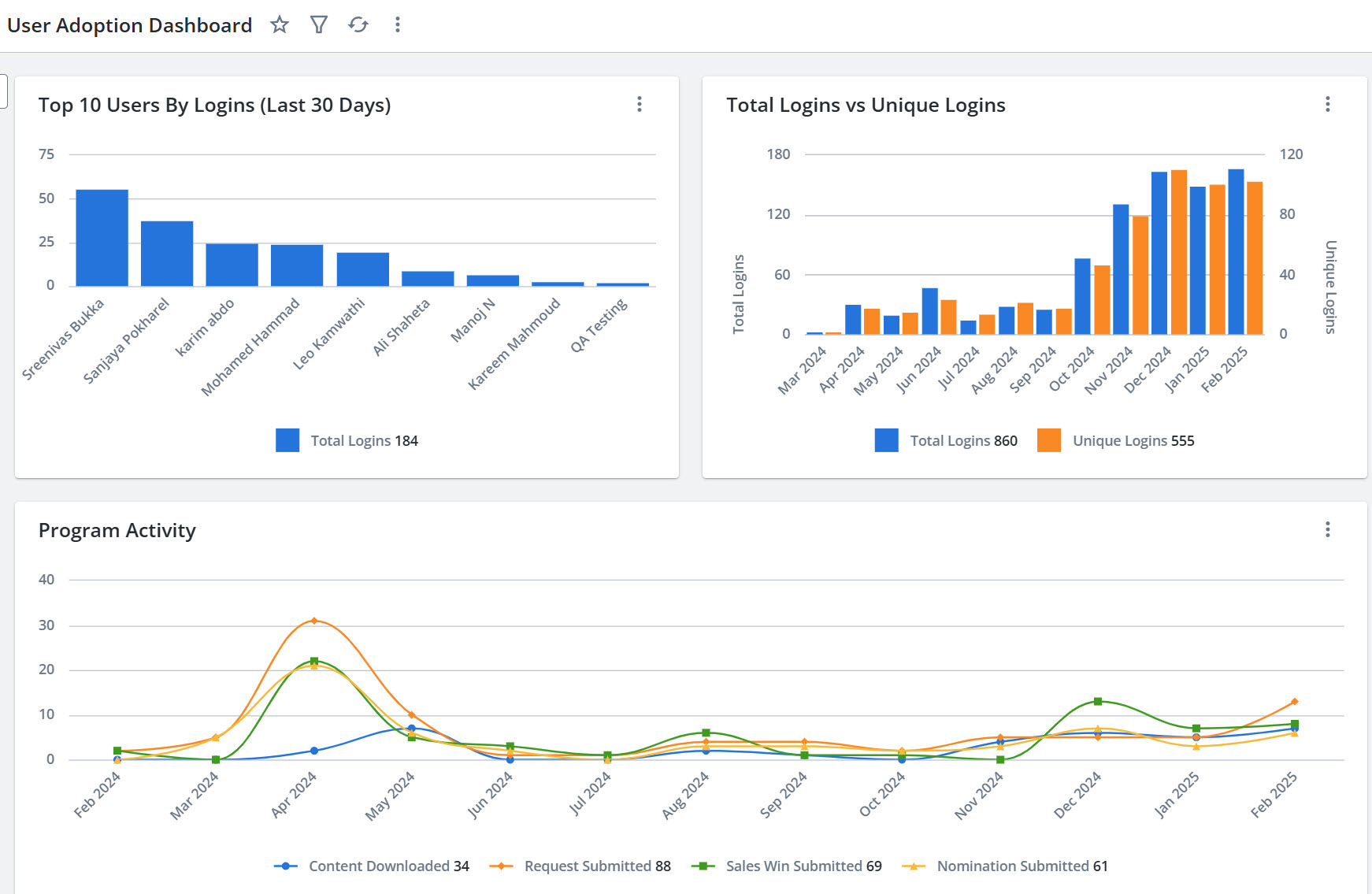
An example of the Upland Analytics User Adoption dashboard.
Note: When a filter is applied, a header with the number of fields that were filtered appears on the dashboard. For more information on filters, see Apply an On-Page Filter - Dashboard.
Top Users By Logins
The Top Users By Logins bar chart shows the top users for the last 30 days (including the current day). The horizontal axis shows the user logging in and the vertical axis shows the number of logins. This chart shows you whether programs are getting any traction and allows you to identify and reward top users and share their best practices with others on your team to drive increased engagement.
Total Logins vs Unique Logins
The Total Logins vs Unique Logins bar chart compares the total number of logins to the unique logins for the last 12 months (including the current month). This allows you to track the total number of unique logins by user to catch sudden drops in engagement or downward trends; either could signal a potential problem or the need to launch a reminder campaign. You can monitor the total number of new RO Innovation users to prove the success of launching, relaunching, or expanding the reach of your voice of the customer program. If your launch or expansion efforts do not lead to an increase in new users, you can catch potential roadblocks early and refine your approach to enable future success.
Program Activity
The Program Activity line chart shows a monthly breakdown of program activity, such as the number of downloaded assets, submitted Nominations, Requests, and Sales Wins in the last 12 months (including the current month). In addition to showing logins, this chart also gives you insight into user activity, displaying what areas and workflows users are engaging with the most.
Note: The Upland RO Innovation Help Center has information on Upland RO Innovation standard dashboards, fields, sources, and related events. To learn more about working with the dashboards and reports, see the Upland Analytics Help Center.